Howdy, Stranger!
It looks like you're new here. If you want to get involved, click one of these buttons!
Quick Links
OMMFG **PUKE**
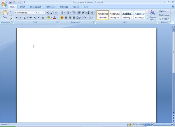
Microsoft Word 2007

one question:
WHY?
It looks like you're new here. If you want to get involved, click one of these buttons!
Microsoft Word 2007

one question:
WHY?
Comments
/shrug
A Work in Progress.
Add Me
Change my mind so much I can't even trust it
My mind change me so much I can't even trust myself
Wikipedia: http://en.wikipedia.org/wiki/Microsoft_Office_2007
Debuting in the Beta 1 refresh is the Office button. It replaces the File menu and provides access to functionality common across all Office applications, including but not limited to Opening, Saving, Printing, and Sharing a file. Users can also choose color schemes for the interface.
2. But im sure you could have designed it better yourself.
"There's no star system Slave I can't reach, and there's no planet I can't find. There's nowhere in the Galaxy for you to run. Might as well give up now."
Boba Fett
I'm indifferent towards it.
I don't like it because, I don't know how to describe it, but there is too much space. Everything is just too, open. The blue color could be better as well.
The reason I like it, is because all that open space, means that it was probably streamlined an assload.
We barely remember who or what came before this precious moment;
We are choosing to be here right now -Tool, Parabola