Howdy, Stranger!
It looks like you're new here. If you want to get involved, click one of these buttons!
Quick Links
EVE Online: UI Changes in Apocrypha
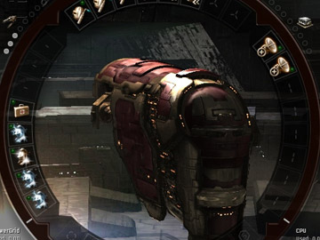
The folks at CCP are working on a number of new goodies for Apocrypha, EVE Online's next expansion, including new Tech 3 ships with sub-systems. To keep up with a constantly expanding game, EVE's UI team is making changes to the fitting screen, and today we take a look at those changes.
CCP Sharq and I have been working on Apocrypha as part of the mythical UI team. Essentially we form a small team creating new UI designs and reviewing the UI as needed. Being a UI design team only, we coordinate with the various scrum teams to get the designs and improvements implemented. This structure has given us the needed flexibility to adapt to the UI requirements of the scrum teams so far.
One of the biggest changes, UI-wise is the redesign of the fitting screen. With the introduction of Tech 3 ships with sub-systems, we decided it was time for an overhaul. As sub-systems change the look of Tech 3 ships, it would be useful to be able to see how the ship changes as you fit different sub-systems. At the same time we wanted a unique interface rather than another Excel-in-space window. With this in mind, we came up with a new design. We arrange the modules, rigs and sub-systems in a ring around the ship (codename: Stargate, and later: Viewmaster 2000), with collapsible side panels for item selection and ship statistics.


Comments
Read UI Changes in EVE: Apocrypha
linky not working right?
I suppose it is nice that they are fixing some of the setup screens, but that is not really a big issue with the current UI.
They need to fix those HORRIBLE cascading menus left over from the 90's. Put all the commands on the assignable to keys list . When I want to do something in a hurry, I most certainly don't want to fumble through those ridiculous menu trees anymore.
Until they fix this, Eve will have one of the worst UI's in the game no matter how many screens they update.
Actually there is a very good addition in the new UI if you look for it.
You can save and load your fitting loadouts now.
This has been one of the features I heard discussed most in Eve, glad their finally adding it!
Only part of the UI I would like altered is the Fleet and Drone UI.
Everything else i've gotten used to.
Back when I started I used to have a low res CRT playing Eve. With the target screen, fleet window, drone window and Overview along with two chat boxes i could see maybe four inches of the screen.
Back then I would call EvE UI the worst, but now with a slick 22" Widescreen its far from the worst imo.
A bad UI is one were when you start playing a UI it makes it almost impossible to play the game so you quit.
Eve's UI was never that bad, its only slow with all the right clicking.
Playing: Nothing
Looking forward to: Nothing
I must say that these new UI changes are nice and the new features like being able to save loadouts is also great & will save me plenty of time when doing the very wide range of things I do when playing EVE.
The thing that worries me the most with the up coming expansion is the NEW minimum system requirments, as I understand the old client is going to be removed all together and the one that replaces it is going to require that players graphics cards support at least Shader 2. Now although Shader 2 has been around for a fair amount of time there are still a lot of people/players that don't have cards that support it.
So what is going to happen with those people? Are they just going to be left to the side and told upgrade or boot off? I don't like to think about it but I can see this having a bit of an impact on the player base & possibly the amount of people that are going to want to play the game.
Anyway the NEW UI is surely a better idea than the stupid idea of walking in stations when the game needs other things that are more important.
Here one Day Gone The Next.
Game reviewer.