You can tell that's actually the shadow of a tree, in both FFXIV and GW2, shadows are blurry or blocky depending on how high you set them to, but none of them look like a real shadow.
P.S. That's Windhelm in ESO
Your point? The shadows in FF XIV ARR look like their supposed to as well. I also have played ESO and no, ESO is graphically NOT better than FF XIV ARR.
Highest settings in ESO.......shadows are missing everywhere.
So you should probably post an in game screenshot like this instead of concept art made for showing off.
Ff14 is an awesome game. Dunno why you people have to hate on something whenever it is doing well. One thing I will say that not a lot if any people touched on though. The content takes way too long to bring out.(then again can't blame them for that) FF14 is one of those games where you know it will be here three years down the line and still a p2p game. So, if you don't like it now just give it time and comeback when there's more to do. If you hate the game because you think the graphics are bad or some other silliness it maybe time to head over to lenscrafter.
That is actually a screenshot of Windhelm in Elder Scrolls Online. I don't get where people think ESO has ugly graphics, maybe it's how their graphics card handles it, but on my computer it reminds me of the first time I played Age of Conan, I was blown away by the graphics, especially for an MMO.
It's not Skyrim, and people saying it's Skyrim just proves my point, ESO ftw
P.S. My Desktop runs a 32gb ram, i7 4th gen, and Titan Black, works great for CAD programs, and works even better for gaming
Originally posted by Gravarg That is actually a screenshot of Windhelm in Elder Scrolls Online. I don't get where people think ESO has ugly graphics, maybe it's how their graphics card handles it, but on my computer it reminds me of the first time I played Age of Conan, I was blown away by the graphics, especially for an MMO. It's not Skyrim, and people saying it's Skyrim just proves my point, ESO ftw
I have a GTX 770 2gb and an eight core 8350 and 8 gigs of ram at 1866mhz, so no, it's nothing to do with graphic.
FF XIV ARR still looks better.
And the person who called it skyrim edited his post.
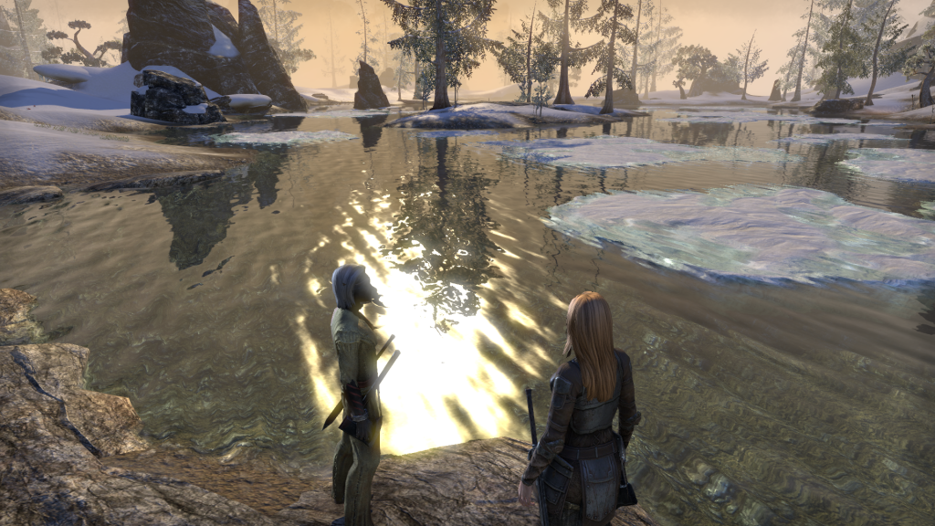
Since everyone is posting pretty pictures for some reason, I want to post one I took of TESO yesterday.
Not even sure what's going on anymore though. There's many MMO's that look good visually (both aesthetically and graphically) in their own ways. FFXIV, GW2, Age of Conan, TESO, etc. etc. etc. When I get immersed though, I hardly notice graphical flaws personally. IF what's being argued is FFXIV's graphics, and how they hold up compared to other titles, I think they hold up just fine.
Originally posted by ThumbtackJ Since everyone is posting pretty pictures for some reason, I want to post one I took of TESO yesterday.
Not even sure what's going on anymore though. There's many MMO's that look good visually (both aesthetically and graphically) in their own ways. FFXIV, GW2, Age of Conan, TESO, etc. etc. etc. When I get immersed though, I hardly notice graphical flaws personally. IF what's being argued is FFXIV's graphics, and how they hold up compared to other titles, I think they hold up just fine.
They both look equally great. The users here are trying to bait people is all. FF looks 10% better than ESO but, like you said, when were in and having fun, I don't notice anything wrong even if there is something wrong.
ESO highest settings:
FF XIV ARR lowest settings, laptop standard option:
I can not name a single instance where bashing a game you don't like leads to more people playing your preferred game.
"As you read these words, a release is seven days or less away or has just happened within the last seven days those are now the only two states youll find the world of Tyria."...Guild Wars 2
The one thing that FFXIV has over the others is how spells and abilities look, but it's nothing new for a Final Fantasy game, they've always had the best looking shinies in the business lol. I think they all look great, but I guess I'm just tired of everyone picking on ESO's graphics all the time. I've ran ESO on my laptop, and Skyrim on my desktop side by side, and really they both look similar. Skyrim has two things better, one is the view distance, which comparing an MMO and an RPG, you'll never be able to compare the two genres in this part of the graphics. Secondly is with Skyrim you can mod it to be super high res and almost realistic, but with stock graphics, they look pretty similar to me.
Originally posted by Neobloodline3dI checked out the free weekend to see what's changed and I'll share a few of my experiences with you fine folks.Firstly, I noticed they have not changed the beginning experience at all. You are still forced to do the same 2+ hours worth of running back and forth clicking on nonsense zero difficulty quest targets. This is highly irritating. During this time you discover one of the major flaws of this games design which is zoning. Every 4 minutes you will be looking at a black screen with letters. This is extremely irritating and a throw back to playstation 1 days and Final Fantasy 7. We are living in 2014 now. This may be a direct result of intending the game be played on consoles. I refuse to give a pass to bad repetitive game design simply to make the console crowd feel less inferior.Secondly, I'd like to say a word about skills. The skills in this game are annoyingly generic. Compared to GW2 skills which are detailed and distinct and artistic these skills and actions are punctuated by generic bursts of exaggerated light. All of them. This is not entertaining after you realize you're going to be looking at it every time you are forced to spam the same skills over and over. Next I'd like to take a moment and call attention to the overall graphics. I hear talk about how great the graphics are in this game but it is far from reality. They've taken photos of real materials and pasted them over every surface. This may seem an intelligent thing to do but it's very repetitive and has no artistic style whatsoever. It gives an initial impression of realistic textures but fades quickly into being overused and a lazy way to cover a lot of model area as quickly as possible. You'll be looking at the same repeated bland world textures and semi-seamless textures for most of your first 2 days and beyond. You'll be greeted by many other examples of lazy development such as copy and pasted trees, rocks and formations which have somehow been strewn across the landscape sometimes in a row. Armor textures are not as sharp as they should be. When your camera is pulled out they look pretty good but zooming in will reveal some horrendously ugly defects which destroy the immersion of detail. I'm also highly irritated they have the same character designs from release. Every character in this game looks like a prepubescent teenager. Everything is this game has an impressively thick glaze of femininity. There's no balance.I'd also like to mention the incredibly bad running mechanics. This is the biggest game killer for me. There is no immersion whatsoever when your character doesn't feel rooted to the world you are running in. Your character will literally slide. You will not feel like your character is firmly planted on ground. Your character glides across the surface at an even z axis without so much as a hint of following a contour based on the ground of which you are running. Running up stairs is an action of gliding across the ground watching your legs move underneath a fixed point of your body and then sliding at an angle across the top of the stairs as if there are no stairs. For 90% of your time you will not be fooled by their poor running illusion. The game has great cut scenes as expected from final fantasy games. This is the highlight of the entire game. The game also has top notch enemy designs. It's to bad enemies are all camped out in mass spawns just hanging out looking stupid with no point. This sort of design does not earn a game a 8/10 rating. The first 2 days experiences alone and the fact that immersion is non existent in this game demand a score closer to 3/10. If you have to force yourself through swamp pits and quicksand and months of pathetic gameplay to reach a soft candy center of contentment you are not doing it right. You are wasting your money. 8/10 MMO games are fun and entertaining from beginning to end. This game is not even close.I have more niggles as to why this game is dramatically overrated in 2014 but this will do for now.
Well said sir, this is exactly what i think aswell.
Congratulations on linking to an almost year old post, unfortunally i fell for the FFXIV hype back then and bought the game, got to max level and was bored as hell, this is when i realized how ugly the game was. OP is right, most of the generic textures in FFXIV are boring and 2D looking.
Originally posted by LoMaX21 FFXIV:ARR has some of the best grafx we've seen in a long time... ESO is also very nice but they dropped the ball on shadows all this nit picking over small crap... ppl still play WoW and as much as they try to re skin the models it still looks like 15 years old grafx
Comments
Your point? The shadows in FF XIV ARR look like their supposed to as well. I also have played ESO and no, ESO is graphically NOT better than FF XIV ARR.
Highest settings in ESO.......shadows are missing everywhere.
So you should probably post an in game screenshot like this instead of concept art made for showing off.
That is actually a screenshot of Windhelm in Elder Scrolls Online. I don't get where people think ESO has ugly graphics, maybe it's how their graphics card handles it, but on my computer it reminds me of the first time I played Age of Conan, I was blown away by the graphics, especially for an MMO.
It's not Skyrim, and people saying it's Skyrim just proves my point, ESO ftw
P.S. My Desktop runs a 32gb ram, i7 4th gen, and Titan Black, works great for CAD programs, and works even better for gaming
I have a GTX 770 2gb and an eight core 8350 and 8 gigs of ram at 1866mhz, so no, it's nothing to do with graphic.
FF XIV ARR still looks better.
And the person who called it skyrim edited his post.
Open mouth, insert foot.
Since everyone is posting pretty pictures for some reason, I want to post one I took of TESO yesterday.
Not even sure what's going on anymore though. There's many MMO's that look good visually (both aesthetically and graphically) in their own ways. FFXIV, GW2, Age of Conan, TESO, etc. etc. etc. When I get immersed though, I hardly notice graphical flaws personally. IF what's being argued is FFXIV's graphics, and how they hold up compared to other titles, I think they hold up just fine.
They both look equally great. The users here are trying to bait people is all. FF looks 10% better than ESO but, like you said, when were in and having fun, I don't notice anything wrong even if there is something wrong.
ESO highest settings:
FF XIV ARR lowest settings, laptop standard option:
FF XIV ARR at High Desktop settings: https://www.youtube.com/watch?v=fqKdsUq_QPc
Notice how the shodows are perfect and how vibrant it looks.
Just about the same as ESO.
So lets stay on topic people.
A side note:
I can not name a single instance where bashing a game you don't like leads to more people playing your preferred game.
"As you read these words, a release is seven days or less away or has just happened within the last seven days those are now the only two states youll find the world of Tyria."...Guild Wars 2
At 28 seconds in, look at the shadows. Mind you this is on Desktop High settings not max. I live in Florida and it is HOT here.
https://www.youtube.com/watch?v=rw0JuzOMcfU
Congratulations on linking to an almost year old post, unfortunally i fell for the FFXIV hype back then and bought the game, got to max level and was bored as hell, this is when i realized how ugly the game was. OP is right, most of the generic textures in FFXIV are boring and 2D looking.
FFXIV:ARR has some of the best grafx we've seen in a long time... ESO is also very nice but they dropped the ball on shadows
all this nit picking over small crap... ppl still play WoW and as much as they try to re skin the models it still looks like 15 years old grafx
https://www.youtube.com/watch?v=rw0JuzOMcfU
You were saying?
Maybe next time, dont power level to 50 in the first few days of launch and you wont be bored.
This^^^^
+1